Color Contrast

People perceive colors in different ways, so digital content needs to have sufficient color contrast and use visual cues other than color. Whether you're designing web content, graphics, documents, or PDFs, it is essential to use color contrast ratios that meet digital accessibility standards.

Minimum Contrast Ratios


To meet the WCAG standard for color contrast, your text must have at least the following minimum contrast ratios:

  • Normal-size text – 4.5:1
  • Large text (18+ pt font) – 3:1
  • UI elements like icons, buttons, text boxes – 3:1

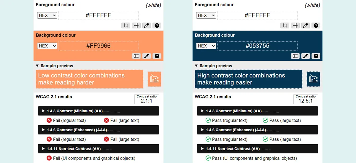
Testing Color Contrast


WebAIM Contrast Checker: This web-based tool allows you to input foreground and background colors directly or select colors using an eyedropper to check their contrast ratio. It also indicates whether the contrast passes or fails.

Adobe Color Contrast Checker: This web-based tool allows you to input or select colors to evaluate their contrast ratio, ensuring accessibility compliance with WCAG guidelines.

Color Contrast Analyzer: This downloadable application, available for Windows and macOS, is designed to check color contrast for various uses, including websites, app development, graphics, PowerPoint presentations, PDFs, and InDesign files. It can also analyze existing designs and more. Request installation from ITS.


Good and bad color contrast

Use of Color


Don't use color alone to convey information.

Color should not be your only method of conveying important information. Individuals with color blindness, or those using limited-color or monochrome displays, may not be able to understand important information if meaning is conveyed only by color. Always use color in conjunction with an additional way to denote important information.

Avoid relying solely on color for:
  • Conveying information
  • Indicating an action
  • Prompting a response
  • Distinguishing visual elements
Best practices
  • Information conveyed with color must also be communicated textually to be effective.
  • The best way to design for users with visual impairments or lack access to color is to provide emphasis using text, identifiers, symbols or patterns.
Don't do this

Example:

  • Dates indicated in red have been canceled: 10/3, 10/5, 10/11.

Why it's bad: Users who are colorblind or low vision may not be able to perceive the color distinction alone.

Do this

Example:

  • Dates marked with an asterisk (*) have been canceled: 10/3*, 10/5, 10/11*.

Why it's good: The asterisk provides a clear, visual indicator that doesn't rely on color alone. This can be easily recognized by all users.

Don't do this
Solid Bar Chart

Why is this wrong? 

This chart only uses color to correlate the data series to the values. Without color perception, these issues become starkly apparent:

Black and white chart
Do this
Bar Chart Pattern

Why is this right? 

Alternatives to color are visible here: the data is differentiated by patterns, as well as color.

Bar chart in gray scale